#947 closed enhancement (fixed)
Theme directory - Commercial Link Placement
| Reported by: |
|
Owned by: | |
|---|---|---|---|
| Milestone: | Priority: | normal | |
| Component: | Theme Directory | Keywords: | |
| Cc: |
Description
Hi,
although I like a lot of what`s been done with the new design the link to commercial theme shops is, imho, misplaced.
In fact in the place where it is now "commercial" doesnt really have any meaning. Most of the visitors won`t even notice it. Those that do probably think that it is related to "upload your theme" link next to it and conclude that it is something for developers.
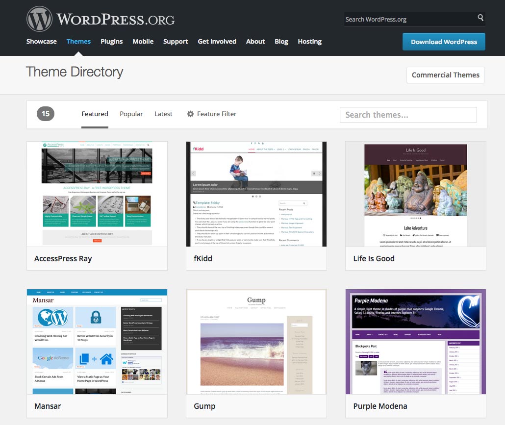
If it were placed in line with "featured","popular" and "latest", before the "filter" then it`d become obvious what "commercial" stands for.
I can confirm that our shop as well as some other shops I`ve been in contact with have experienced 80-85% drop in traffic from this site since the new design was introduced. We came to conclusion that the placement of that link is probably a major reason.
I think both WordPress.org and theme shops gain from having that link on more prominent and logical place like it was before.
In short, please consider moving "commercial" link to its natural position in the bar with "featured", "popular", "latest" and before "feature filter" option.
Hope this helps your efforts to improve theme directory.
Thanks! Marko
Attachments (5)
Change History (50)
#2
 @
@
11 years ago
Since it's really just a list of theme shops, I agree it doesn't belong in the filter bar. I'd probably leave it as-is for now (since there isn't a great place for it) and put some sort of separator between the two like we have in other sections:
Commercial Themes | Upload Your Theme
The theme directory is kind of an outlier here, so placing this kind of information is going to be a little weird using this layout.
#3
 @
@
11 years ago
This added word "Themes" makes the purpose of the link clearer. Thanks for that!
I agree that, considering the bar is a filter and not a standard menu, it could be kind of weird to have a link to a new page there.
I meant from the context point of view it would be more logical to be in line or somewhere near that area. However, we all agreed this is not the place to be so let`s move on:)
My suggestion would be to move the "upload your theme" link in the themes sub-menu. It is completely unimportant for majority of visitors that are searching for themes. Authors, on the other hand, that want to upload a theme will find it wherever you put it:). The "Commercial Theme" would then stay alone there and automatically be more prominent. Could possibly even be accentuated in some way. Here is an idea http://www.anarieldesign.com/wp-content/uploads/2015/03/commercialthemeslink.jpg
Hope we can try something like that. Thanks for the effort!
#4
follow-up:
↓ 15
 @
@
11 years ago
For additional data points, the themes@ email address has also received 2 other reports from listed commercial theme shops indicating a significant drop in traffic after release of the Directory's new theme.
I agree there is some merit to blaming the placement of the "Commercial Theme" link (possible more so in that it occupies the space that previously held the login/username info as still done in the Plugin Directory). Though in the past it's been a small "Commercial" link in the sidebar, which wasn't very prominent either.
There could be other factors at play too (though none seem like they'd be responsible for that much traffic decline):
- The increased size and prominence of the screenshots might favor or hurt certain sites
- The increased size of the theme shop cards in the listing might lead to less scrolling by users, and thus less clickthroughs when randomly listed near the bottom
- With the haikus being hidden by default, it's possible that previously seeing a haiku lead to more clickthroughs for some shops (ok I'm reaching here)
I agree the filter bar is not the best place for the link. But with the Plugin Directory, the "Developers" link ended up in the filter bar for now for lack of a better location.
@melchoyce: Perhaps there is a secondary navigation of some sort that can be introduced identically to both directories to allow for these sorts of links. Eventually the Theme Directory might have to move the "Commercial Themes" and "Upload Your Theme" links if we reintroduce the login/username info which may happen when we eventually allow users to favorite themes (or any other change where showing the current user is beneficial).

This ticket was mentioned in Slack in #design by melchoyce. View the logs.
11 years ago
#6
follow-up:
↓ 8
 @
@
11 years ago
We also saw 80% decline in traffic. I think "Commercial" should be placed into filter bar, same as "Developers" outbound link is placed in Plugins filter bar. Just renaming from "Commercial" to "Commercial Themes" doesn't really do much.
Thanks to all for the effort ;)
#7
@
11 years ago
It is interesting that not more shops reported drastic drop in traffic coming from this site even though everyone experience it.
@coffee2code you are right that "Commercial" link wasn`t that prominent earlier either, but I think it is the logic of placement that plays bigger role then the size of a link and that was somewhat better.
When visitor comes to the "Themes" page she/he decides in a blink of an eye which area is important for her/him. If all that is important is lined up on the left side in the bar, like it is now, then the rest is considered less or non important.
These other factors that @coffee2code mentioned might play a minor role, but certainly not cause 80% drop.
For now, after seeing it done in Plugin directory I`d also rather have that link added to the filter bar. Even though this might not be perfect, it is better then it is now.
Cheers!
#8
in reply to:
↑ 6
 @
@
11 years ago
Replying to BizzThemes:
I think "Commercial" should be placed into filter bar
I think the issue with that is context. Everything on that bar relates to themes (individual themes), while the "Commercial Themes" link, up top, links to a list of theme shops (not individual themes).
So, no, I don't think putting the commercial themes in the filter makes sense, unless we actually list all the commercial "themes" (much like http://WordPress.com/themes does with their "All | Free | Premium" filter).
#9
@
11 years ago
Expanding on my previous comment, having commercial theme shops go through theme review and get their themes listed in the repo (even if one wouldn't be able to download them directly there) would probably not be a bad thing overall. Would provide extra confidence to the user, since they'd be part of the official themes repo (and go through the same checks as all other themes), and probably boost sales for commercial shops!
#10
@
11 years ago
I agree that the context is not totally same, but not that different after all. Plugins filter bar solves this simply by adding a border and it could be the same here (not sure why it's ok for plugin filter bar then). I also agree commercial themes should be listed instead of shops, but this is not related to current problem.
Again, thanks to all for the effort put into this. It means a lot for commercial theme shops to have some official WP support and we give our best to give back as much aswe can to grow the WP community.
#11
 @
@
11 years ago
Overall, traffic is considerably down on the commercial themes page.
Just to keep a record of the changes on this page:
- On the morning (EST) of March 4, we switched the "Upload Your Theme" and "Commercial" links.
- This morning (EDT), we changed "Commercial" to "Commercial Themes"
The former change resulted in ~30% increase in traffic to the commercial themes page (comparing week to week; but still preliminary data). We don't yet have data on the latter change yet.
Also note that overall "exit" traffic to the page has increased by ~2% since the switch to the new theme directory. This indicates that, when people get there, they are more likely to click through to a theme page.
However, given that traffic is down considerably, the increase from switching links and the increase in "exit" traffic is likely not noticeable to commercial theme shops.
#12
follow-up:
↓ 13
@
11 years ago
@hugobaeta This is actually really good idea to have commercial themes listed instead of shops. However, that is not something that can be done overnight.
Even though the context of the filter bar (single themes) is not entirely the same as that of commercial themes link (theme shops) it is similar in a way that both are focused on the users searching for themes.
The context in which the link is now doesn`t make any sense. It stands together with the "upload your themes" link that is there for developers and for non-developer visitors has no importance.
#13
in reply to:
↑ 12
@
11 years ago
Replying to Anariel Design:
The context in which the link is now doesn`t make any sense. It stands together with the "upload your themes" link that is there for developers and for non-developer visitors has no importance.
Shame on me for not taking a deeper look into this before commenting :P
I compared with the plugins repo and I agree, there should be consistency between the two - most definitely. I particularly think the themes repo shouldn't mess with the location of the login section. I made an experiment, let me know what y'all think:

The idea is to bring back the user account section to it's rightful place, same as in the plugins repo. I played with adding the "Upload your theme" item there, but it could be moved elsewhere. (maybe like the plugins, as an item on the bar - but that would be even more confusing IMO). Added the "Commercial Themes" item to the filter bar, and removed the number count - is that really necessary? We don't do that on the plugins repo either. I still think things aren't grouped in the most logical way (search is relative to the themes on the repo, hence should be closer to that group of items, and maybe commercial themes could move to the far right, but that would create a bigger gap between plugin and themes repos).
Just putting it out there, hopefully this can move the discussion forward! :)
#14
follow-up:
↓ 16
 @
@
11 years ago
The Commercial link really shouldn't be anywhere near the filter bar. I would rather hide it in a drop down menu before doing that.
I'm not opposed to bringing back the user information area if we have something else to link to there too, but I don't want "Upload theme" to be the text of that. We have had many problems in the past with users trying to upload a theme to their own websites by uploading it here. Avoiding that confusion is important too, even with the in-between page we have now.
#15
in reply to:
↑ 4
@
11 years ago
Replying to coffee2code:
@melchoyce: Perhaps there is a secondary navigation of some sort that can be introduced identically to both directories to allow for these sorts of links.
I like this a lot, actually. The old layouts had sidebars, which we're missing now. And that's fine, but we still have links that we need to place on the page which aren't related to a specific theme/plugin but are related to the directory overall. Having a place to put these links, for both cases, would be preferable to splitting the single filter bar.
#16
in reply to:
↑ 14
@
11 years ago
Replying to Otto42:
I don't want "Upload theme" to be the text of that. We have had many problems in the past with users trying to upload a theme to their own websites by uploading it here. Avoiding that confusion is important too, even with the in-between page we have now.
I agree. Maybe the text could be "Contribute a theme".
#17
@
11 years ago
I had this idea, in my earlier post ,for "upload your theme", or however you want to call it, to be moved to a drop down menu (under Themes). It is unnecessary for that link to be on the page whose main focus is on the visitors searching for themes. At the same time maybe you`d avoid having the problem with "upload" confusion.
@Otto42 Why would you want to remove "commercial" link from the site, before adding it to filter?
The commercial shops are at the same time authors of many free themes in the repository and I don`t see a reason for keeping those two so separated. In the end it is a theme directory and ideally it should equally present free and commercial themes that play by WordPress rules.
#18
follow-up:
↓ 24
@
11 years ago
Let's take a step back for a second.
The bar up top is there for filtering and drilling down into available themes and plugins on WordPress.org. As such, it should only contain items related directly to filtering and searching through themes and plugins in the directories.
I strongly feel that both Commercial Themes (which doesn't list themes, but instead lists theme shops), and the Developers link in the plugin directory, do not belong in the filter bars. It just doesn't make sense. The bar is there to interact with your results — both of those take you outside of those directory views.
The big problem we're encountering right now with the new theme and plugin repo designs is that they don't really make room for secondary or meta navigation. We should try to find a way to be able to include that level of nav, rather than squeezing items into space they don't contextually belong.
Replying to Otto42:
Replying to coffee2code:
@melchoyce: Perhaps there is a secondary navigation of some sort that can be introduced identically to both directories to allow for these sorts of links.
I like this a lot, actually. The old layouts had sidebars, which we're missing now. And that's fine, but we still have links that we need to place on the page which aren't related to a specific theme/plugin but are related to the directory overall. Having a place to put these links, for both cases, would be preferable to splitting the single filter bar.
Pretty much this, yeah.
@samuelsidler pointed out to me earlier that https://make.wordpress.org/community/ has a secondary navigation bar. While I kind of hate this (a lot), I think it's a much more contextually appropriate approach than putting items into the filter bar, for both the theme and plugin directories.
#19
@
11 years ago
I think @hugobaeta proposal fixes the issue at least temporarily. I'd only change text from Commercial Themes to just Commercial as it was before.
At the moment, filter bar takes almost all real estate at the top, which is why it's so difficult to put links elsewhere, when no sidebar is available. I think issue with Commercial link context is not present here. It's more of an issue with giving it such an important place on site.
#20
@
11 years ago
yes, the temporary fix from @hugobaeta is something to consider. At the moment at least no better options are available. Of course, if the link comes to the filter it should loose that "themes" that was added as its purpose in the filter would be clear.
I don´t think visitors would look at it and think in context of does a link belong to the filter or not. Technically it doesn´t, but people don´t think that way. It makes more sense to see "featured", "popular","latest" and "commercial" lined up together then having "commercial" and "upload your theme" in separate block.
It is not perfect, but till better solution comes out certainly acceptable.
#21
follow-up:
↓ 22
@
11 years ago
Before we get further into this discussion where to place that commercial link I`d like to point out much bigger problem that I discovered today.
Filter bar doesn`t work at all in IE11!
It shows 0 themes whatever you click. I attached the screenshot of what that.
When you refresh the site the themes show up for a second and then disappear again.
In plugins directory filter works fine.
#22
in reply to:
↑ 21
;
follow-up:
↓ 23
 @
@
11 years ago
Replying to Anariel Design:
Would you mind opening a new ticket for that? Thanks.
#23
in reply to:
↑ 22
@
11 years ago
Replying to obenland:
Replying to Anariel Design:
Would you mind opening a new ticket for that? Thanks.
I already have:)
#24
in reply to:
↑ 18
@
11 years ago
Replying to melchoyce:
The big problem we're encountering right now with the new theme and plugin repo designs is that they don't really make room for secondary or meta navigation. We should try to find a way to be able to include that level of nav, rather than squeezing items into space they don't contextually belong.
Absolutely!
https://make.wordpress.org/community/ has a secondary navigation bar. While I kind of hate this (a lot), I think it's a much more contextually appropriate approach than putting items into the filter bar, for both the theme and plugin directories.
That could be a solution, until we have time to revisit the navigation/iA models on .org sites.
I'll put it visually in a mockup, in a second.
@
11 years ago
Idea for a second level navigation on the directory. Similar to https://make.wordpress.org/community/meetups/. Brings back user section on the top-right.
#25
@
11 years ago
I find this solution appropriate for the current state of the directory.
Thanks for the effort!
#26
follow-up:
↓ 28
 @
@
11 years ago
We also saw a significant drop in traffic. Can you fix this? This solution looks like a good fix to me: https://meta.trac.wordpress.org/ticket/947#comment:13.
It might not seem like a big deal to @Otto42, but it directly affects the revenues of all GPL theme shops listed. Premium theme shops have already been vilified by WP.org for years now (in favor of plugins that are practically unrestricted to do anything) and I think this is the final nail in the coffin.
#27
@
11 years ago
@Fthemes: The last solution presented here, with the secondary nav bar, is what we'll probably end up going with.
#28
in reply to:
↑ 26
;
follow-up:
↓ 29
@
11 years ago
Replying to Fthemes:
Premium theme shops have already been vilified by WP.org for years now […] and I think this is the final nail in the coffin.
Suggesting the drop in traffic was caused willfully is not only preposterous, but borderline offensive. Development for the new Directory happened publicly over the last three months, including the discussions around where these links should be placed. Not once did we get feedback from theme shops.
#29
in reply to:
↑ 28
@
11 years ago
Replying to obenland:
Replying to Fthemes:
Premium theme shops have already been vilified by WP.org for years now […] and I think this is the final nail in the coffin.
Suggesting the drop in traffic was caused willfully is not only preposterous, but borderline offensive. Development for the new Directory happened publicly over the last three months, including the discussions around where these links should be placed. Not once did we get feedback from theme shops.
I can't help but to be angry. Not because of the link misplacement (it happened, so let's fix it), but because of answers I read on this ticket from WP.org team. @Otto42 initially even suggested to hide it under a drop-down, @coffee2code is dealing with upload link and @melchoyce wants the filter bar pure (nobody cares about plugins bar I guess). All while the original issue is significant drop in traffic. I probably overreacted, so sorry about it, but I just don't think you know how significant impact this minor change has on small theme shops. Let's see how it goes with second navigation, but I'm afraid it won't fix the original issue.
#30
@
11 years ago
I suggest we all calm down a bit, arguing won´t bring us very far.
All shops experience the same drop in traffic and revenue suffers very much as well, especially for the small shops. However, changes are there and won´t be undone. So, we need to find the best solution within the current setup.
Considering the number of shops here, total revenue drop easily exceeds tens of thousands of dollars a day and should be taken seriously by all sides included. If it all connects to the placement of that link I can´t be sure, but it certainly is connected to the recent change in design.
I know that the purpose of the WP.org team is not to boost sales of theme shops, but if commercial theme page exists then it should be functional as well and serving as many visitors as it can. After all WP.org team and theme authors are two sides of the same coin.
My suggestion would be to put "commercial" in the filter, leave it a few days and see if that changes statistics.
If it does, then we´ve isolated the problem and can work from there.
#31
@
11 years ago
We are not going to put "Commercial" in the filters.
Right now, we're seeing an increase in traffic having added "Themes" to the "Commercial Themes" item. I'd like to see how that places out and how much it increases traffic over a short period of time, which means giving it a full week to see what happens.
After that, if the increase is not substantial enough to bring it back to how traffic was, we should try the mockup proposed in comment 24 and see if there's an increase.
#32
@
11 years ago
Although I don´t understand such a strong opposition to trying the idea of "commercial" link in the filter considering the "developers" link, that really doesn´t belong to the filter, end up there in plugin directory I´d like to share traffic changes in our shop as some kind of reference.
- The day the changes were introduced traffic drop from WP.org was 80% and stayed at that for days
- 3 days ago, after adding "Themes" it went up a bit, yet still 70% less then before the change
- 2 days ago, after fixing the issue with directory not loading in IE it went up again and now we are at about 50% of the traffic we had before
I guess you should see similar statistics as well.
Hope this helps a bit!
#33
@
11 years ago
@Anariel Design: I don't like the placement of the Developers link on the plugins directory either, and will probably move it up to the secondary bar as well.
#34
@
11 years ago
Can we now test the second navigation option? We can confirm the similar results as @Anariel Design has reported. Slight improvement with renaming, but nowhere near the previous levels.
This ticket was mentioned in Slack in #meta by obenland. View the logs.
11 years ago
#37
@
11 years ago
There seems to be a glitch with the menu. It happens on irregular basis, but often when you click on Themes then you go to Plugins and back or after refresh. The links (commercials themes and upload your theme) get pushed to the right and the submenu disappears.
I attached a screenshot of it. I tried it in Chrome, Mozilla and Safari.
#38
@
11 years ago
Also think it needs some more of the styling copied over from the P2's. Hover colors and the like.
#39
@
11 years ago
It has hover colors. Not the same colors as on the P2, but it uses the regular, blue hover colors.
#40
@
11 years ago
After a week of second navigation bar in live use, we'd appreciate if @samuelsidler could share the analytics data for Commercial page (just to see if link placement issue is now fixed). From our data, traffic did slightly increase, but it's still 50% down from previous levels. Not sure if @Otto42 had this in mind: https://cloudup.com/ceEP3qEyMZc ?
#41
follow-up:
↓ 42
@
11 years ago
Not a fan of that blue background for the bar, but I would like to make it use the same styling as on the https://make.wordpress.org/community/ site, just for consistency across the sites.
#42
in reply to:
↑ 41
@
11 years ago
Replying to Otto42:
Not a fan of that blue background for the bar, but I would like to make it use the same styling as on the https://make.wordpress.org/community/ site, just for consistency across the sites.
https://make.wordpress.org/community/ definitely looks better and I agree, it adds more consistency across all sites. Currently, font is too small and slim and hover effect is not the same.
#43
@
11 years ago
I can confirm statistics from @BizzThemes on our site.
The traffic that we see is more or less the same as it was, 50-60% less than before.
Do you think that having that "commercial themes" link placed near the "upload your theme" could be a part of the problem here? The "upload your theme" link might be giving that section a wrong context. Visitors may see it as something not related to them, a developers corner. Any thoughts on that?
#44
@
11 years ago
- Resolution set to fixed
- Status changed from new to closed
We've taken a pretty deep look at stats for the new theme directory. By all accounts, the only stat that is lower than the old directory is page views for the commercial themes page. Every other metric is either up or even to where it was previously.
Moving the location of the link can only do so much, as evidenced by the stats we've gathered and the various changes we've made (three, so far).
It's entirely likely that the image-heavy (instead of text-heavy) design is causing people to use the directory and not click on sublinks as frequently as they did with the previous design. We're satisfied with this result.
Closing this ticket as fixed, based on the three changes we made (ultimately settling on the subnav option as most effective).
#45
@
11 years ago
Can we then at least adapt styling as per @Otto42 suggestion? https://meta.trac.wordpress.org/ticket/947#comment:41
We're certainly open to play with the placement of the link, but I don't think having it in the filter bar would be something I'd consider natural.
Do you have other ideas?
@melchoyce, do you have an opinion on what might work?