#2896 closed enhancement (fixed)
Community Section on WordPress.org page
| Reported by: |
|
Owned by: |
|
|---|---|---|---|
| Milestone: | Priority: | normal | |
| Component: | General | Keywords: | ui-feedback |
| Cc: |
Description
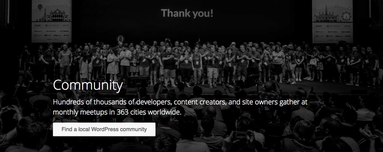
There should be a button in Community Section on WordPress.org page saying something like "Find WordPress Community Near You".
This button should take the user to the meetup page for WordPress. https://www.meetup.com/topics/wordpress/
This should help in increasing the awareness about local WordPress communities.
Change History (12)
#2
 @
@
7 years ago
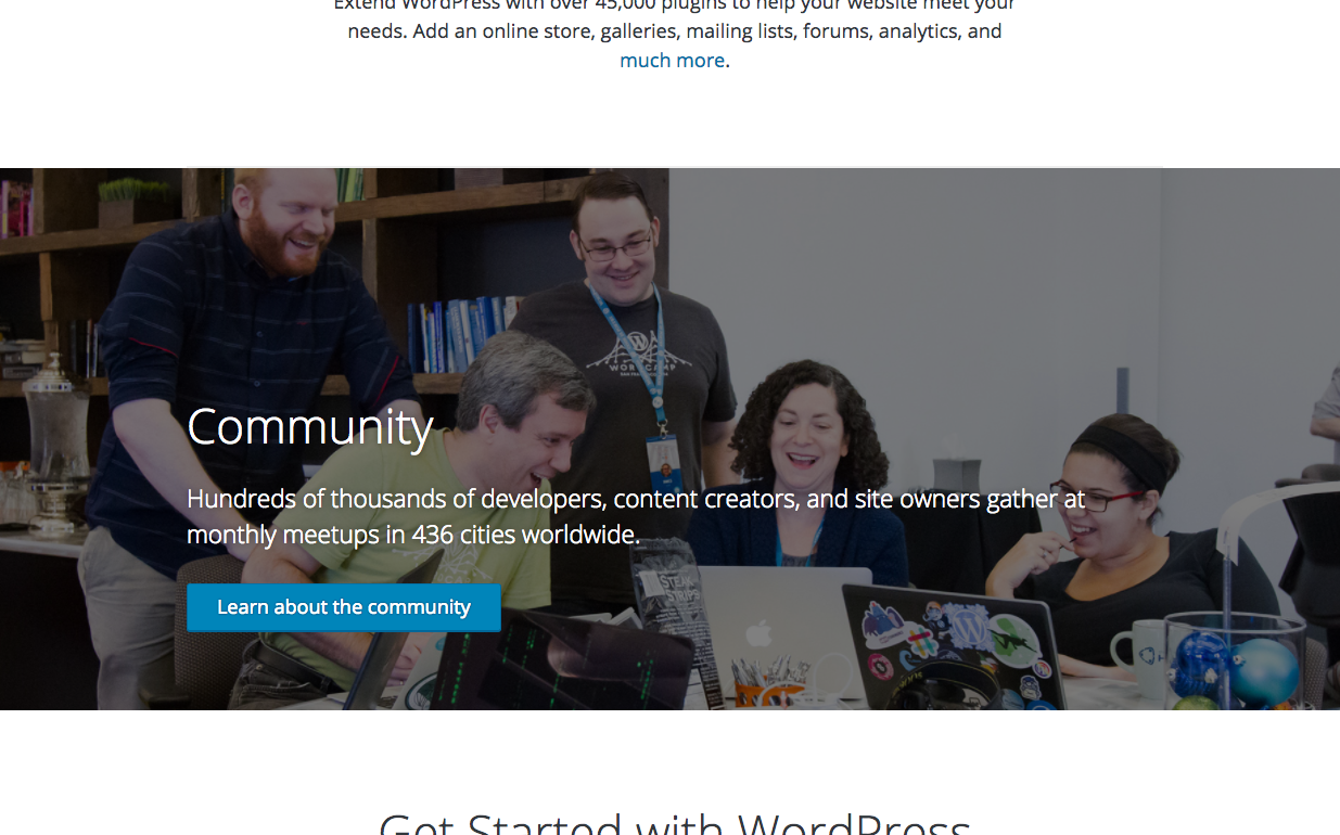
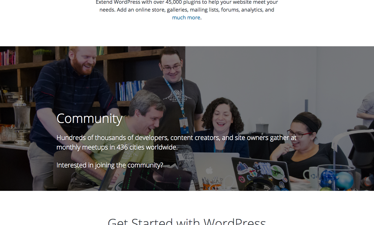
Here's some quick mockups around this idea.
Thoughts:
- The button stands out more, but seeing as none of the other sections have a button (except for the Get WordPress), it's probably too much.
- The link doesn't stand out at all, but none of the links are very obvious on this homepage. Do we change all links so they stand out better, or just this one?
- I like the link best b/c it aligns better with the other sections. Maybe just a bit more work needs to be done with it?
#3
follow-up:
↓ 4
 @
@
7 years ago
I like the link best b/c it aligns better with the other sections [but it] doesn't stand out at all
Does the mockup show it in white instead of blue just because it was a rough draft? Or is there a reason to not make it blue like the others?
From a laymen's perspective, adding a blue link seems good enough to achieve the goal of this ticket. We can always iterate on the overall design later to make all the links more visible.
#4
in reply to:
↑ 3
;
follow-up:
↓ 5
 @
@
7 years ago
Replying to iandunn:
Does the mockup show it in white instead of blue just because it was a rough draft? Or is there a reason to not make it blue like the others?
The blue was not readable against the dark background. Something that might work here, is to have the link be underlined when the user hovers over any part of the whole section.
#5
in reply to:
↑ 4
;
follow-up:
↓ 6
 @
@
7 years ago
Replying to mapk:
Something that might work here, is to have the link be underlined when the user hovers over any part of the whole section.
That would be my suggestion as well.
On a related note, Community appears to be the only section that's not centered, is that intentional?
#6
in reply to:
↑ 5
 @
@
7 years ago
Replying to SergeyBiryukov:
On a related note, Community appears to be the only section that's not centered, is that intentional?
Yes, after discussions with Matt, that's what was agreed upon.
#7
 @
@
7 years ago
@iandunn You are right! This button should take to the landing page URL mentioned in above comment.
Regarding the UI, I strongly believe that it should be a Call-To-Action like follows:-
<p>Interested in joining a local community around you?</p>
<button>Find A Local WordPress Community</button>
#8
 @
@
7 years ago
The button works better, in my opinion. I'd go for that over the link. What about a secondary button, so it doesn't conflict with the primary button in the following section?
I'd also recommend updating the button copy to be action-oriented, similar to @divyadeepsawhney's suggestion.


I like this idea.
I wonder if a link would fit in better than a button? cc @mapk
I think it'd be better to link to https://make.wordpress.org/community/meetups-landing-page (like the Core Events widget does), rather than directly to meetup.com, since that'd give us more flexibility and DRYness. See https://github.com/coreymckrill/nearby-wordpress-events/issues/9 for background.
Although, I wonder if it'd be better to just say something like, "Interested in joining the community? Just login to wp-admin on your site and enter your location in the WordPress Events and News widget."
That might be better long-term, since they'd see it regularly instead of just once when they manually look for it. It'd also include WordCamps in addition to meetups. It might be best to avoid using the word "widget", since that might confuse people into looking in at
Appearance > Widgetsinstead of the Dashboard.