Opened 8 years ago
Closed 16 months ago
#3373 closed enhancement (fixed)
Plugin Directory: Single page link styling is all over the place
| Reported by: |
|
Owned by: | |
|---|---|---|---|
| Milestone: | Priority: | normal | |
| Component: | Plugin Directory | Keywords: | needs-patch |
| Cc: |
Description
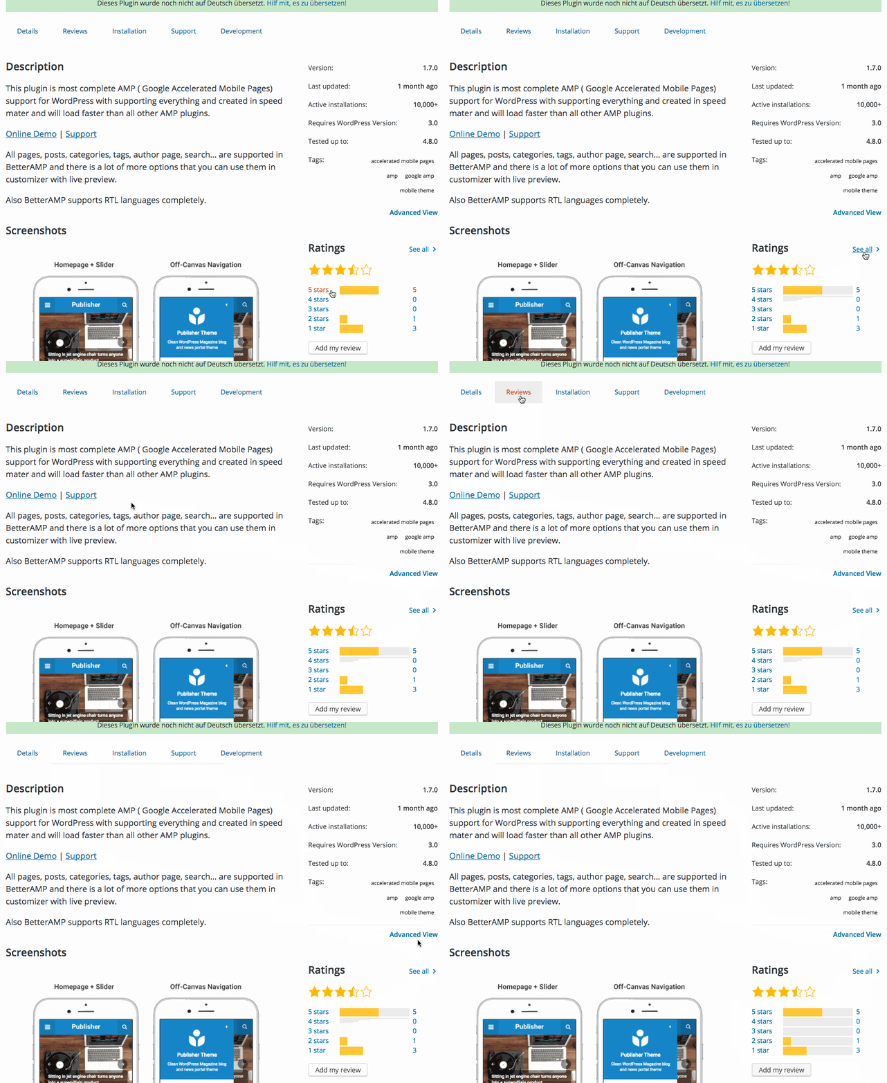
I just noticed that the link styling on the Single plugin page in the Plugin Directory is all over the place. Can we get these to be more consistent?
Proposed Solutions:
- Remove any orange hover colors from all links. I think that's a very old remnant.
- "Advanced View" should probably be underlined because it's a link all by itself in the sidebar.
- The Ratings links should remain the same.
- The tabs and the content links should just have the orange hover color removed.
Change History (8)
#2
in reply to:
↑ 1
 @
@
8 years ago
Replying to obenland:
So no hover animation for underlined links?
There should be something visual. Here's a couple ideas.
Any thoughts around these? I think these styles would primarily apply to the content links, and not necessarily the sidebar. I can ping the design team for thoughts in next week's design meeting.
Here's the codepen: https://codepen.io/mapk/pen/GydQNX
#3
follow-up:
↓ 4
 @
@
8 years ago
Personally I'm not a fan of either, but that's a design decision for sure. @travel_girl has been vocal about link display recently, maybe she has an opinion?
#4
in reply to:
↑ 3
 @
@
8 years ago
Replying to obenland:
Personally I'm not a fan of either, but that's a design decision for sure. @travel_girl has been vocal about link display recently, maybe she has an opinion?
I like the first one myself.
I'd love to hear what @travel_girl thinks if she's been making strides here.

This ticket was mentioned in Slack in #design by travelgirl. View the logs.
8 years ago
#6
 @
@
7 years ago
Hey, just found the ticket by a happy accident (didn't get a notification).
I agree, that the link hover styles could be more consistent. We made different styles for the links, to make it a11y and still as less noisy as possible.
The sidebar Links don't have and underline, because their stand alone and can still be seen as links. So we made the decision to not underline them, and give them an underline by hovering.
The links in the content has to be underlined, otherwise there are not visible for people for colorblindness. But I agree, that the color change to orange is not optimal, because the color difference is not really visible in black and white.
The hover animation für the menu is an indicator for the tabs. But from my point of view, we could style them the same way like the sidebar-links.
From the Suggestion from @mapk I would prefer the first version (bold underline).
Or as a third suggestion: We could make the whole link (including text) bold as an indicator for the hover.
#7
 @
@
5 years ago
I think at the very least we should remove #d54e21 and add text-decoration: underline to most links (content links) on .org.
What would we need to do?
Remove Color (Add underline where applicable)
wporg/css/base/_links.scss:25
wporg-developer/scss/page-dashicons.scss:125
wporg-learn/css/trumps/_overrides.scss:3
wp4.css:70
Thoughts?
#8
 @
@
16 months ago
- Resolution set to fixed
- Status changed from new to closed
This was worked on with the new theme for the plugin directory.
https://make.wordpress.org/meta/2024/04/30/the-plugin-directory-gets-a-refresh/
I believe this was fixed.


So no hover animation for underlined links?