Opened 4 years ago
Last modified 16 months ago
#5008 new enhancement
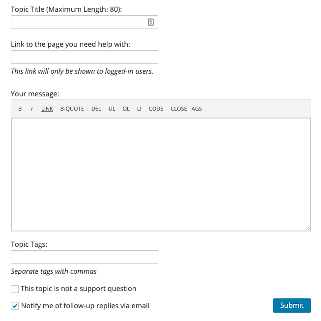
Improve forum input fields' contrast and UI
| Reported by: |
|
Owned by: | |
|---|---|---|---|
| Milestone: | Priority: | normal | |
| Component: | Support Forums | Keywords: | has-patch needs-design-feedback has-screenshots |
| Cc: |
Description
Other areas of WordPress.org such as "Edit Forum Profile" and "Edit WP.org Profile" have input fields spanning the full width of the screen, as well as better contrast between label and field, plus their styling is nicer.
I propose improving the forum fields' styling to mostly match the other areas and improve UI experience.
Attachments (4)
Change History (15)

This ticket was mentioned in Slack in #forums by dd32. View the logs.
4 years ago
This ticket was mentioned in Slack in #design by valentinbora. View the logs.
4 years ago
#5
follow-up:
↓ 6
 @
@
4 years ago
Looks good. In parallel with the increased font size, it would be good to have a possibility to select a smaller font, in order to see more of your text in one screen. Perhaps a tick box in the editing toolbar, next to "CLOSE TAGS"?
#6
in reply to:
↑ 5
 @
@
4 years ago
Replying to tobifjellner:
Looks good. In parallel with the increased font size, it would be good to have a possibility to select a smaller font, in order to see more of your text in one screen. Perhaps a tick box in the editing toolbar, next to "CLOSE TAGS"?
I believe the increase/decrease font size buttons in the reply editor would merit a separate ticket.
This ticket was mentioned in Slack in #design by valentinbora. View the logs.
4 years ago
This ticket was mentioned in Slack in #meta by valentinbora. View the logs.
4 years ago
This ticket was mentioned in Slack in #design by valentinbora. View the logs.
4 years ago
#10
 @
@
4 years ago
I would love if we could update all these form elements to match core's input elements, which were recently redesigned with color contrast in mind.
Could we even... use Gutenberg's form components on the front-end of these sites? (I understand if that's like, way, way out of scope here)
Screenshot of the current styling of input fields on Support Forums