#3673 closed task (blessed) (fixed)
Improve WordPress download page
| Reported by: |
|
Owned by: |
|
|---|---|---|---|
| Milestone: | Priority: | normal | |
| Component: | General | Keywords: | |
| Cc: |
Description (last modified by )
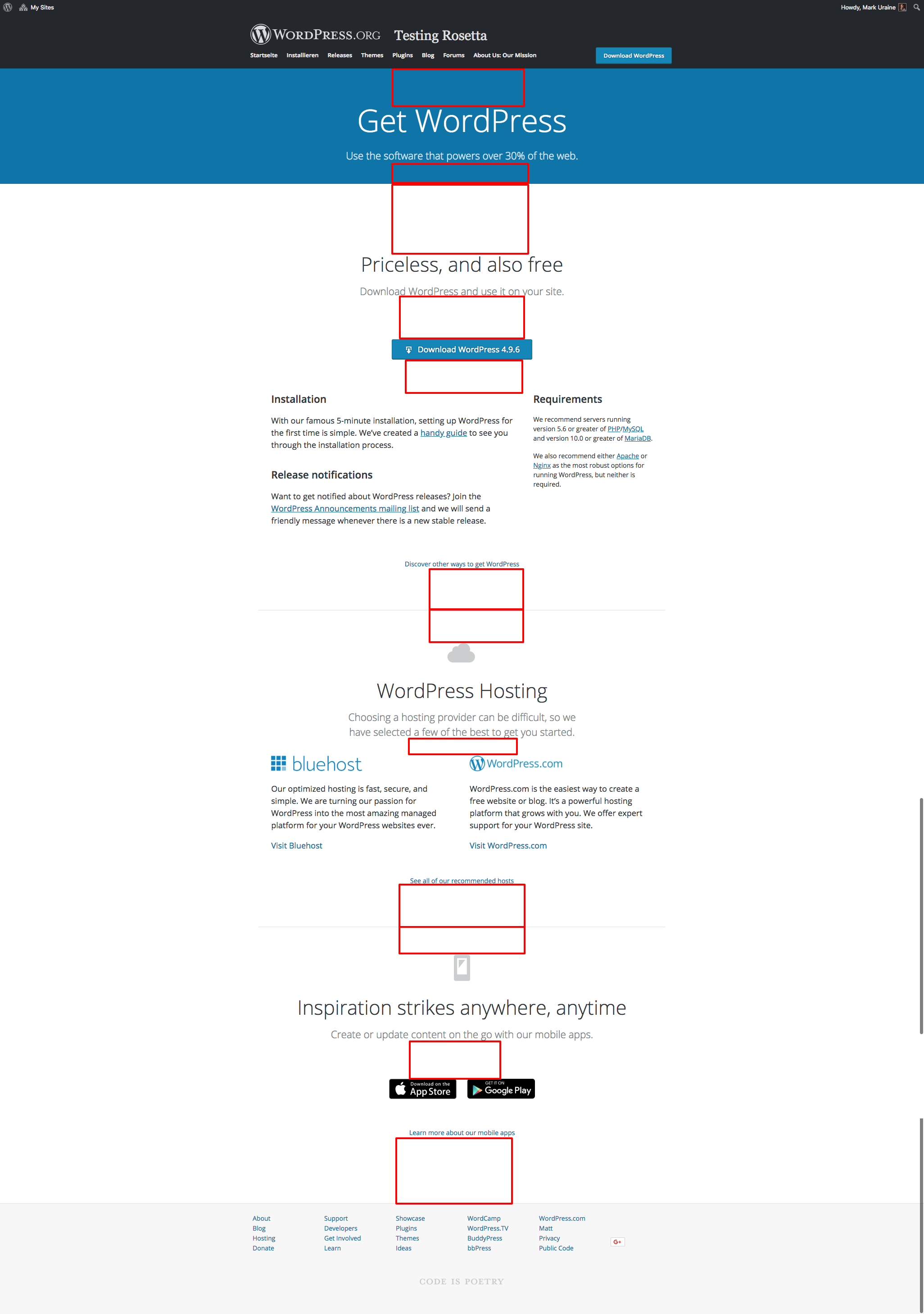
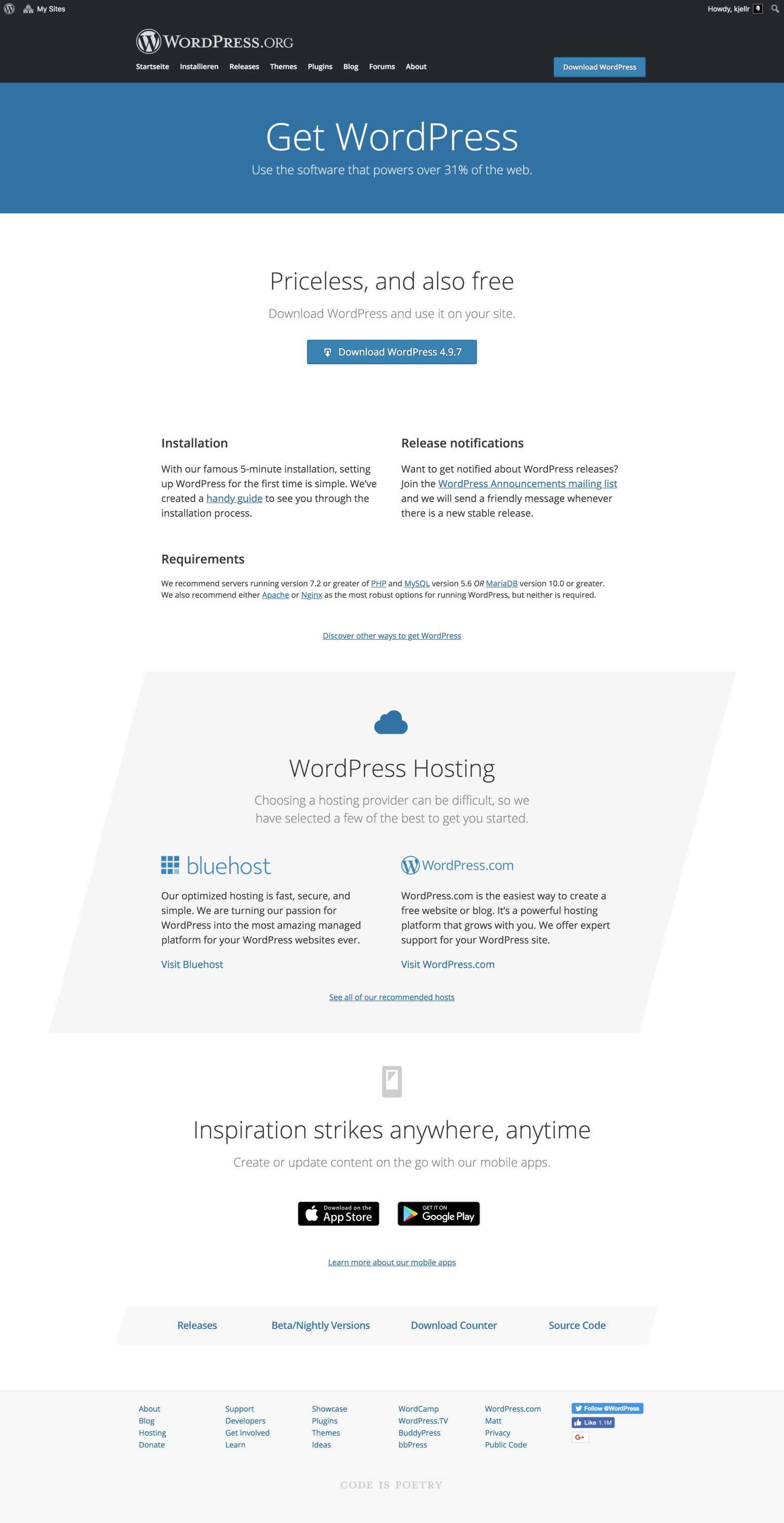
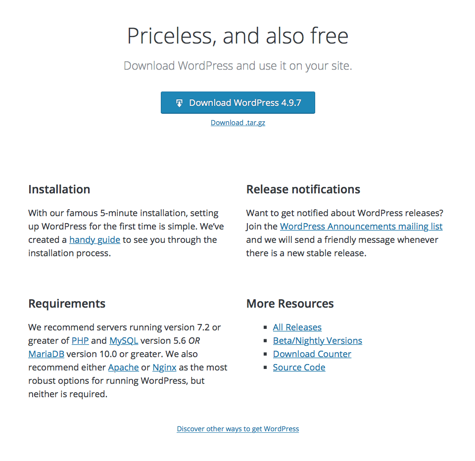
Let's take @mapk's design and @melchoyce's updates to it, and come up with a more useful downloads page for WordPress.
Background:
https://make.wordpress.org/meta/2016/02/29/get-wordpress-improving-the-path-to-wordpress/
https://make.wordpress.org/meta/2016/03/23/get-wordpress-mockups/
Mark's original mockups:
https://cloudup.com/cqnVMWCehkK
Current iteration:
https://test.wordpress.org/get/
Attachments (6)
Change History (80)
#3
 @
@
6 years ago
We should discuss these suggestions and decide on which elements we want to go with. Maybe during one of the upcoming meta chats @tellyworth?
#5
 @
@
6 years ago
Current iteration is available at https://test.wordpress.org/get/
Design, URL, template name, pretty much everything, is subject to change of course.
#7
 @
@
6 years ago
Current iteration is available at https://test.wordpress.org/get/
It's lookin' good, @obenland!
I think some of the vertical rhythm needs adjusting here. Most, or all, of these red boxes should be approximately the same height.
#10
 @
@
6 years ago
We should start making decisions soon on which direction we should go design-wise.
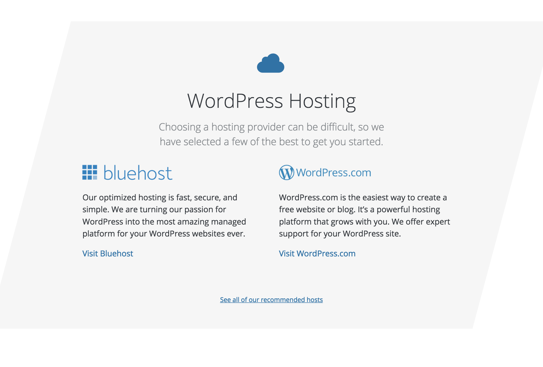
By default, .entry-content has a max-width, so if we could avoid having a special case here for a full-width gray background, I'd like that. I like the continuation of the shapes design-pattern for the hosting part, but find it a bit much in the Guides section.
Guides is also something that might make for a good v2, as we don't really have those guides available yet, afaik.
#12
follow-up:
↓ 14
 @
@
6 years ago
Some notes:
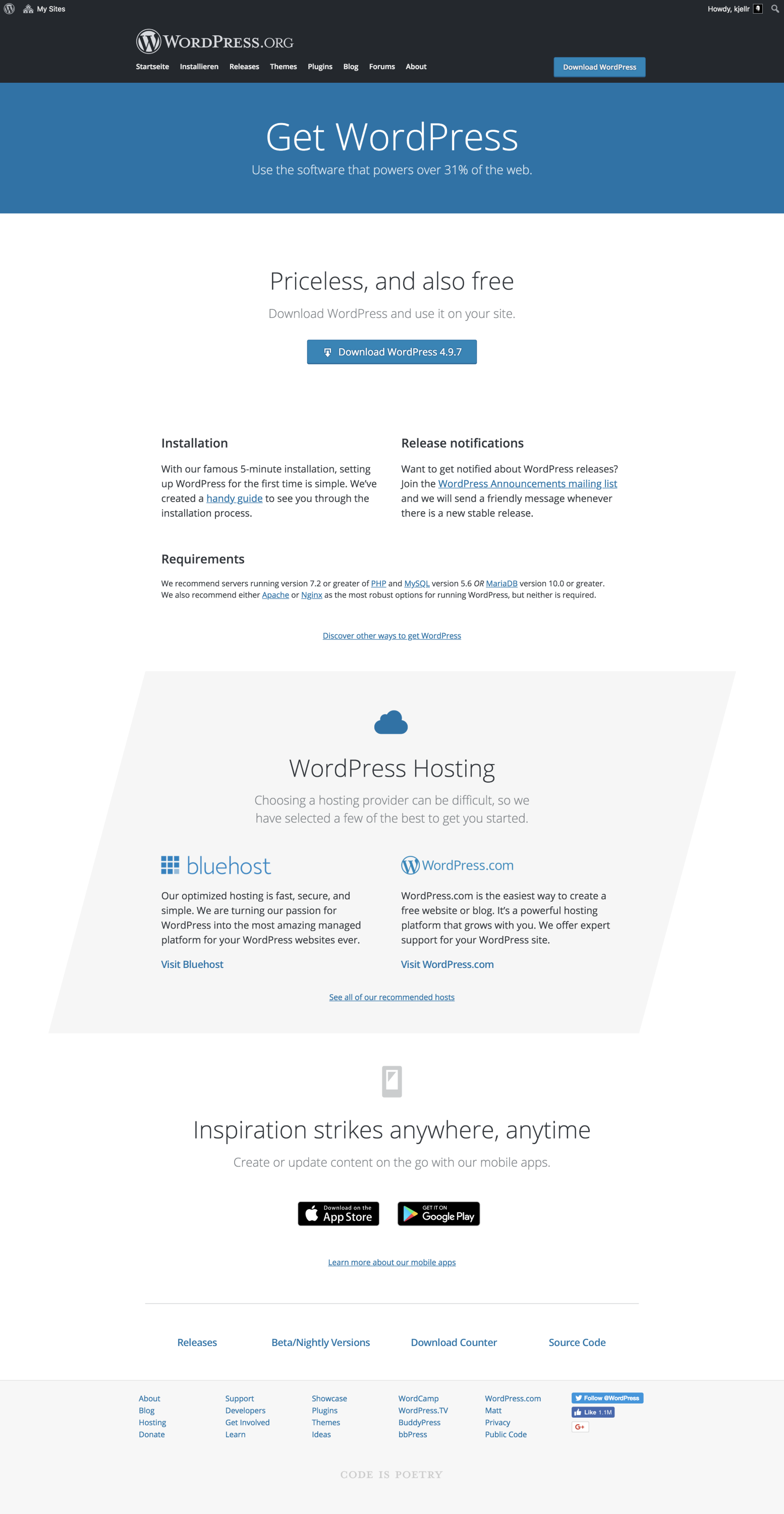
- Use the software that powers over 30% of the web. - is there a better noun than "software" that works here?
- Priceless, and also free - needs explanation. The words "open source" don't appear on this page.
- Having the Requirements column in a smaller font looks slightly off to me. Possibly because it has 2 paragraphs and so looks otherwise similar to the left col beside it.
- Discover other ways to get WordPress seems redundant since the page it links to has primary content that is very similar to this section. If it said something about open source and linked directly to https://wordpress.org/download/source/ or better I'd be happier.
- The Bluehost and WordPress.com typefaces feel unbalanced. I know they can't really balance because of text size differences but it looks like a mistake because the colours and fonts are similar.
- Should the hosting logos and names be linked?
- The App Store button has a grey border around it (part of the image) that makes it look fuzzy or pixellated by comparison to the Google Play button.
#14
in reply to:
↑ 12
 @
@
6 years ago
Replying to tellyworth:
- The Bluehost and WordPress.com typefaces feel unbalanced. I know they can't really balance because of text size differences but it looks like a mistake because the colours and fonts are similar.
Yeah, that is a bit unfortunate. The logos are exactly the same size, it's just the font that's different. Short of using a different wp.com logo, I'm not sure how to change that
- The App Store button has a grey border around it (part of the image) that makes it look fuzzy or pixellated by comparison to the Google Play button.
It's the way Apple's marketing guidelines ask us to use it. However it looks like Google updated theirs recently, and now they both look equally bad.

This ticket was mentioned in Slack in #meta by obenland. View the logs.
6 years ago
#17
 @
@
6 years ago
Some thoughts I had when looking it over:
- Will the hosts be rotating, and is WordPress.com being added as a featured host on .org?
If they are static, it further blurs the lines of .com vs .org if we add .com as a prominent host on the downloads page, potentially leading to more confusion?
I also suspect we'll see more complaints of the same kind we had when the hosting page was updated, maybe even more as this is a much more prominent location.
- The requirements text needs to be refined (we recommend PHP 7.2, so the combined PHP/MySQL line won't work).
- Should we have some more spacing or something between the hosts on mobile? the spacing between the "Visit <host>" link and the next host logo is the same, there's no natural separation between the two hosts then.
- I also agree with @tellyworth that "Priceless, and also free" needs to be defined better somehow, considering more and more people are starting to realizing the concept of "If you don't pay for a product, you are the product".
- The text under the sections are wide block links, I was surprised when I suddenly clicked a link when not scrolling on a tablet, as I touched the screen then changed my mind about scrolling further. Could we change these to be just the text as a link?
#18
 @
@
6 years ago
Overall this looks really great. I have a few bits of feedback.
Firstly, the background when on smaller screens seems a little weird, I for a moment thought I had a smudged screen.
The 'discover other ways to get WordPress' feels a little lost and close to the next section. If we mean it to be understated why is it in the top section?
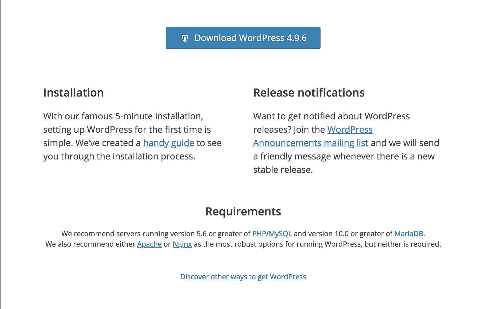
I do wonder about the grid of having 2 / 1 at the top and then 1 / 1. It feels a little off to me but if the copy is fixed I am not sure of a better option. I do think it would be less jarring without reducing the font size on the requirements section.
The 'visit bluest/wp.com' and 'feel all recommended hosts' links feel very lost to me in text. Perhaps bringing in a different color or making these more prominent? Again the 'see all of our link totally gets lost for me'.
'Learn more about our mobile apps' also suffers from this. Perhaps we could solve this by not having such a small font? Keeping it the same as the body seems a good way forward here and aligns with the about us pages.
On smaller devices this page shines, which is so great. I would probably suggest scaling back the typography scale a little on smaller devices, those headers are huge! Also reducing some line heights and spacing would tighten it all up nicely.

This ticket was mentioned in Slack in #meta by obenland. View the logs.
6 years ago
#20
 @
@
6 years ago
This is looking great! I really like that we're moving the mobile app section to the top of the page on small screens. Great move. 🙌
A few minor suggestions:
I agree with @karmatosed that the 2/1 grid at the top seems a little odd on larger screens. Maybe we could place the Installation + Release Notifications items side by side, and slide the Requirements in below?
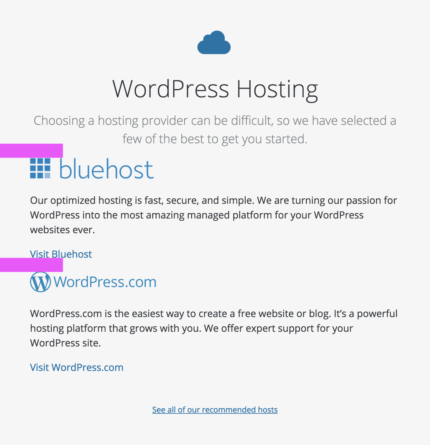
Between 480px and 768px wide, the host blocks have no top margins. This makes the "Visit Bluehost" link appear closer to the WordPress.com logo than to the Bluehost content. We use 2rem top margins for these blocks on small screens, and I'd probably adapt those at this breakpoint too.
... In fact, I'd recommend keeping that 2rem top margin on all breakpoints. 🙂 I like that it gives the host blocks equal top/bottom spacing:
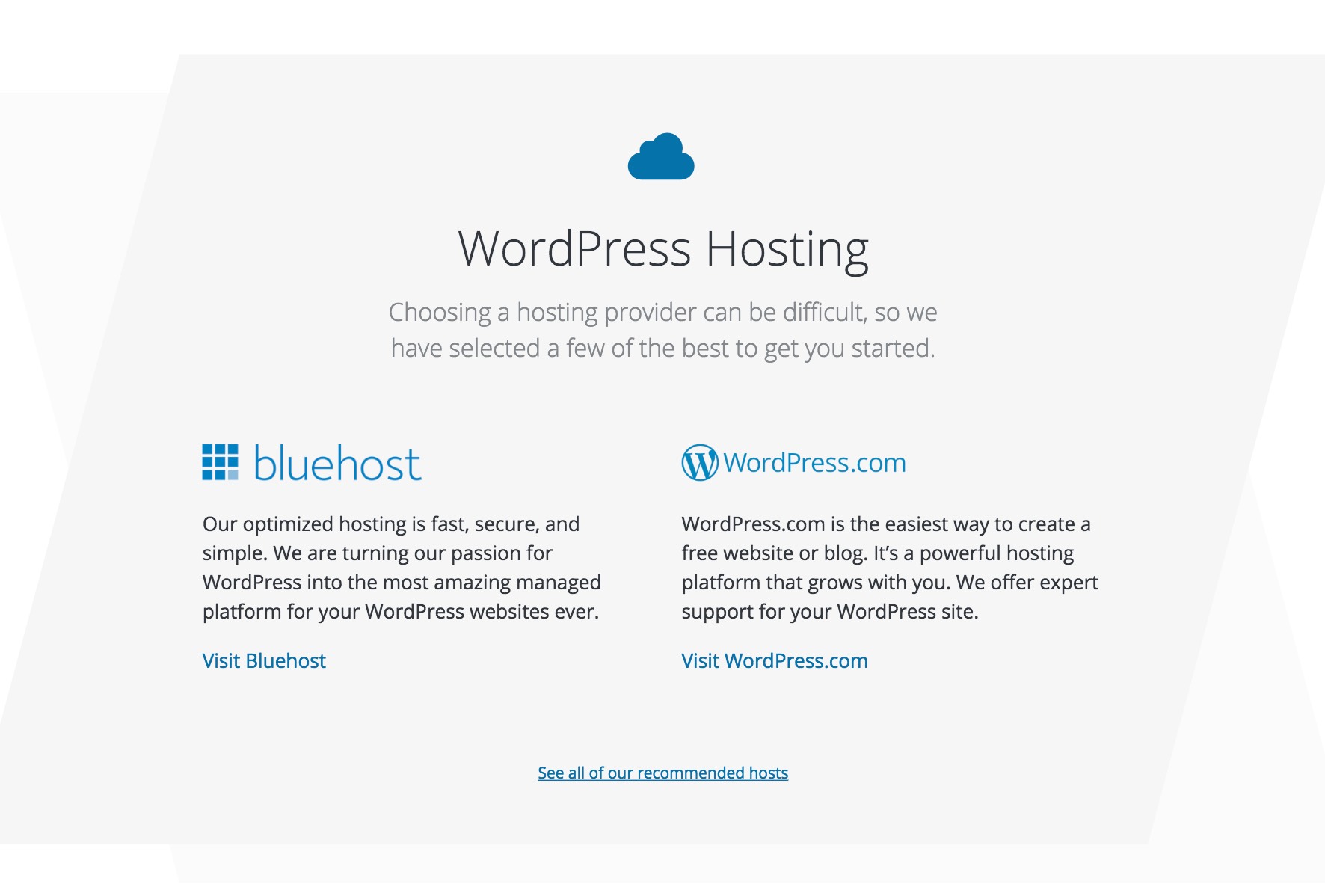
I think the parallelogram usage would be more successful if we removed the lighter one underneath. Since the lighter one is so light (yet also so similar in tone to the darker parallelogram), its presence makes the top parallelogram less distinct. If the darker parallelogram were alone against white, it'd be a bit more clear:
Finally, I'm seeing some horizontal scroll overflow on all the browsers I tried (Safari 11.1, Chrome 67, Safari on iOS 11.4.1)
#22
 @
@
6 years ago
The updates look great! One other suggestion:
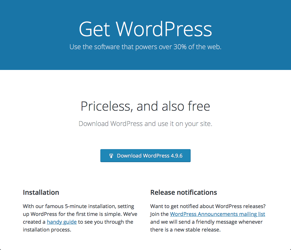
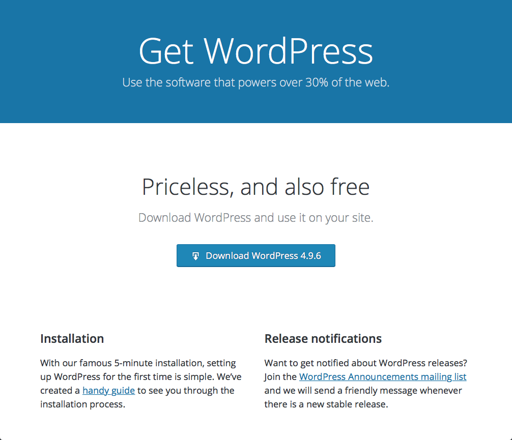
The big download button is sort of floating by itself:
Since the text above conceptually leads into the button, I think it'd be reasonable to remove the 2rem of margin above the button and place it closer to the text. We could add that margin to the bottom of the button instead, so that whole text/button block centered vertically in the whitespace:
#23
follow-up:
↓ 24
 @
@
6 years ago
@Clorith Yes, the hosts listed there will be randomized from the complete list of recommended hosting options.
@obenland @tellyworth If I'm honest with myself, I really dislike using the vibrant polygons behind the Guides call outs.
#24
in reply to:
↑ 23
;
follow-up:
↓ 26
 @
@
6 years ago
Replying to chanthaboune:
Yes, the hosts listed there will be randomized from the complete list of recommended hosting options.
Will the WordPress.com blurb be part of the rotation? Do you know who I can get in touch with for logos and text blurb for the other two hosts?
If I'm honest with myself, I really dislike using the vibrant polygons behind the Guides call outs.
Those guides don't exist yet anyway, right? That's probably a bridge that can be crossed when we get there.

This ticket was mentioned in Slack in #meta by tellyworth. View the logs.
6 years ago
#26
in reply to:
↑ 24
;
follow-up:
↓ 28
 @
@
6 years ago
Replying to obenland:
Will the WordPress.com blurb be part of the rotation? Do you know who I can get in touch with for logos and text blurb for the other two hosts?
Yes, it's part of the rotation. I can reach out to the other hosts (SiteGround, Bluehost, DreamHost) and get updated info.
If I'm honest with myself, I really dislike using the vibrant polygons behind the Guides call outs.
Those guides don't exist yet anyway, right? That's probably a bridge that can be crossed when we get there.
Sure that works for me!
#28
in reply to:
↑ 26
 @
@
6 years ago
Replying to chanthaboune:
Replying to obenland:
Will the WordPress.com blurb be part of the rotation? Do you know who I can get in touch with for logos and text blurb for the other two hosts?
Yes, it's part of the rotation. I can reach out to the other hosts (SiteGround, Bluehost, DreamHost) and get updated info.
If I'm honest with myself, I really dislike using the vibrant polygons behind the Guides call outs.
Those guides don't exist yet anyway, right? That's probably a bridge that can be crossed when we get there.
Sure that works for me!
Hi all, Dave here from Bluehost. I've asked our head of marketing to evaluate the blurb and I can get the latest vector logo to you!
#37
 @
@
6 years ago
@kjellr Would you mind taking another look at this? I ported over the child pages from the existing download page that we will need to link to, but the new design doesn't really offer an easy way to do that.
The existing download page with navigation: https://wordpress.org/download/
The new download page: https://test.wordpress.org/download/
The child pages are:
- https://test.wordpress.org/download/releases/
- https://test.wordpress.org/download/beta-nightly/
- https://test.wordpress.org/download/counter/
- https://test.wordpress.org/download/source/
For the About page we solved it by adding a paragraph of links to all child pages half way down the page: https://wordpress.org/about/
Any ideas here are greatly appreciated.
#38
 @
@
6 years ago
Hello!
Francesca for SiteGround. Here is the blurb.
We’re hosting experts, so you don’t have to be. Get top-tier website performance and support regardless of your technical skill. Join millions of happy clients using our WordPress services featuring all the help you need at a price you’ll love.
I'll send the logo to Josepha via email :)
Thanks!
#41
 @
@
6 years ago
Would you mind taking another look at this? I ported over the child pages from the existing download page that we will need to link to, but the new design doesn't really offer an easy way to do that.
@obenland Here's a attempt at incorporating those links. This is pretty straightforward — it borrows the text styles from the "Visit XXX" links in the host callout, and just adds a simple horizontal rule above them on desktop.
#42
 @
@
6 years ago
@kjellr Thanks for spending time on this!
Do you think we could find a way to give them context and make them flow a little more with the page? I wonder if they should be given a bit more prominence too, maybe before the hosting section?
When I first looked at the screenshot I did not see the links and thought it was a before picture, only when I got to the mobile view I realized I should double-check :)
#43
follow-up:
↓ 44
 @
@
6 years ago
Do you think we could find a way to give them context and make them flow a little more with the page? I wonder if they should be given a bit more prominence too, maybe before the hosting section?
What sort of context did you have in mind? A label/description or some sort?
In terms of prominence + placement, my thought was that these links on the whole seemed potentially less helpful to visitors of the page than the hosting section. That said, where will the "Discover other ways to WordPress" link point to? I noticed it's not working yet. If that link is meant to be a similar secondary/tertiary link, we could theoretically slot these links in alongside it.
Alternatively, I did explore a slightly more prominent version that might help address the easily-missable quality on desktop:
#44
in reply to:
↑ 43
 @
@
6 years ago
Replying to kjellr:
What sort of context did you have in mind? A label/description or some sort?
Yeah, I think the About page is a great example for giving context to child page links. There they just feel like part of the content.
where will the "Discover other ways to WordPress" link point to?
I don't know :) It's part of @mapk's designs so I added it. He's been afk so I haven't had a chance to ask him yet.
Alternatively, I did explore a slightly more prominent version that might help address the easily-missable quality on desktop
Sorry for being difficult, but I think they still get kind of lost in the sea of footer links. Even with the parallelogram background, with it having the same background color as the footer.
I wish I could be more helpful here, but I'm at a loss too.
#49
 @
@
6 years ago
I think the About page is a great example for giving context to child page links. There they just feel like part of the content.
Yeah, I see. If we were to borrow that treatment, perhaps something like this makes sense?
Walking into this fresh, I'll note that it seems weird to work out sub-navigation on a page by page basis like this. Ideally we can establish a pattern that'll be consistent across all these pages (both in terms of treatment and placement).
where will the "Discover other ways to WordPress" link point to?
I don't know :) It's part of @mapk's designs so I added it. He's been afk so I haven't had a chance to ask him yet.
No worries. When Mark's back he can fill us in regarding that link. He may have some good feedback on these child links in general. 🙂
#50
 @
@
6 years ago
@obenland Could we use a consistent URL for the Hosting page?
- In
front-page.phpit links to the main site:esc_url( 'https://wordpress.org/hosting/' )
- In
page-about-requirements.phpandpage-get.phpthe link is relative and shows a 404 error on Rosetta sites (e.g. https://ru.wordpress.org/hosting/):esc_url( home_url( '/hosting/' ) )
It should either have a centralized URL or be a translatable page, not a mix of both :)

This ticket was mentioned in Slack in #meta by chanthaboune. View the logs.
6 years ago
#55
 @
@
6 years ago
I have editorial-approved copy for the hosts!
Bluehost has turned passion for WordPress into the fastest, simplest managed platform for your websites. Recommended by WordPress since 2005, each WordPress package offers a free domain, free SSL, and 24/7 support.
SiteGround offers top-tier website performance and support regardless of your technical skill. Join millions of happy clients using their WordPress services to get the help you need at prices you love.
Privacy-focused and dedicated to the Open Web, DreamHost provides some of the most powerful and secure managed WordPress environments in the world.


@melchoyce's updates:
https://wp.invisionapp.com/share/4DKKAVCFTYV
I also attached them to this ticket for posterity.